Designing brand identity for a metal gig photographer was an interesting challenge as this particular genre of music or aesthetic has never been tolerable for me. However, researching and finding inspiration was a fun activity and a good way to broaden my graphic design style.
The emphasis on bold display typefaces and use of black were the main observations and what I used for my foundation. However, the logo had to be simple and concise so as to not overshadow the photographs.
Below, are my iterations of a brand identity for the client along with a version to be used as a watermark containing their first name.
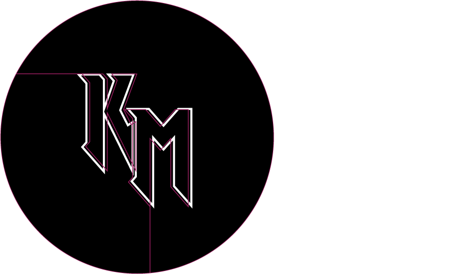


They chose the green version as it had a illuminated neon look to it while acknowledging the metal music scene astutely.
The watermark