Visual Identity Design - Rebranding
As a visual identity assignment at university, we were asked to do a modern rebranding of a not-for profit organisation. I chose to do a rebranding of The National Trust (a conservation organisation for natural, indigenous and cultural heritage) as its current aesthetic looked very dated.



Simplifying the logotype, I stacked “National” on top of “Trust” to resemble a sturdy building with different versions of same font overlaid on top of each other to signify irregularity and variety, a nod to the diverse periods in Australian architecture. Logotype brings together the old and the new. Designed to resonate with people of all ages with the logo colour is a stark white against a grey-brown (to retain a piece of the Trust’s original colour palette) background for contrast.
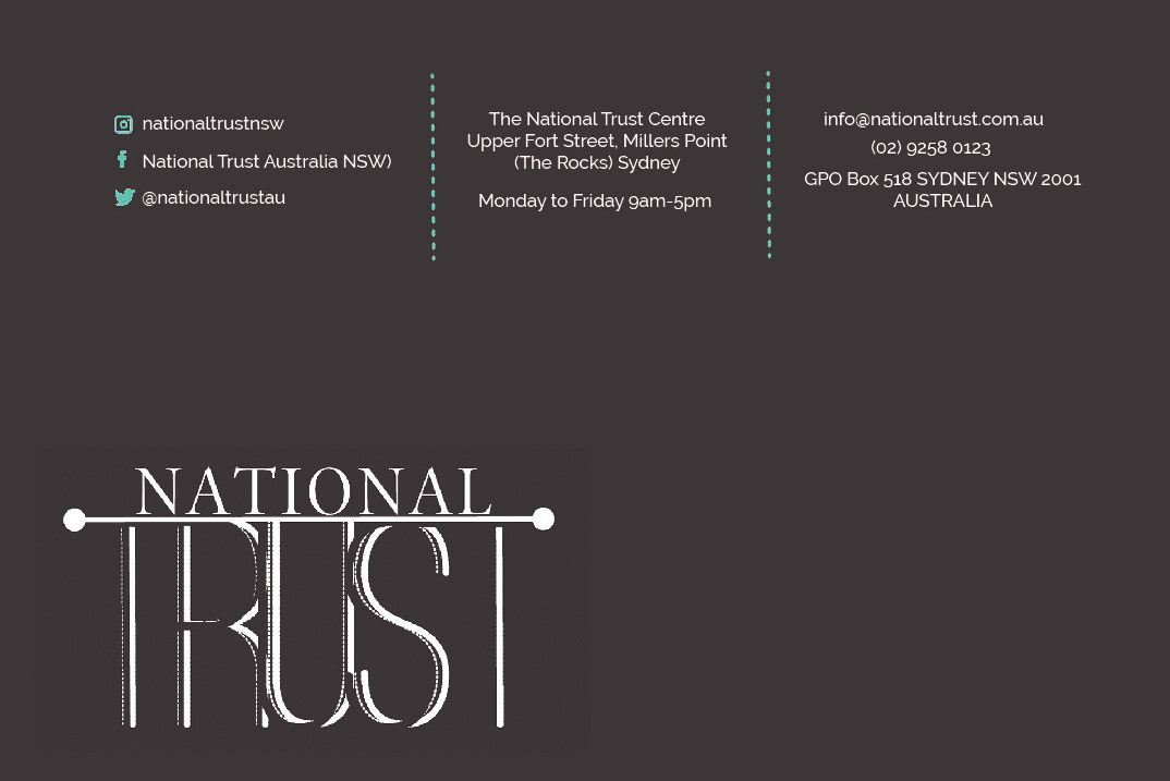

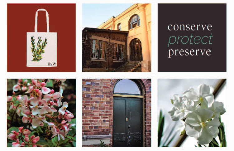
New colour palette represents Australian soil (terracotta), water (sea-green) and stone (grey-brown). The business card is minimalist and clean while the back features a 180 year old brick building now occupied as the main NSW Trust headquarters.

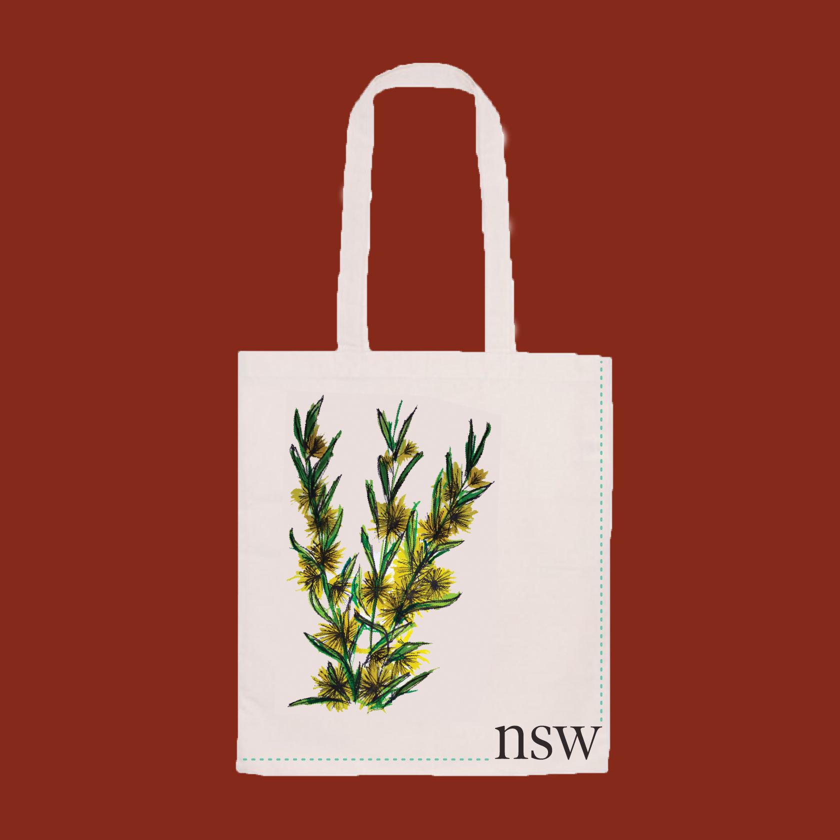
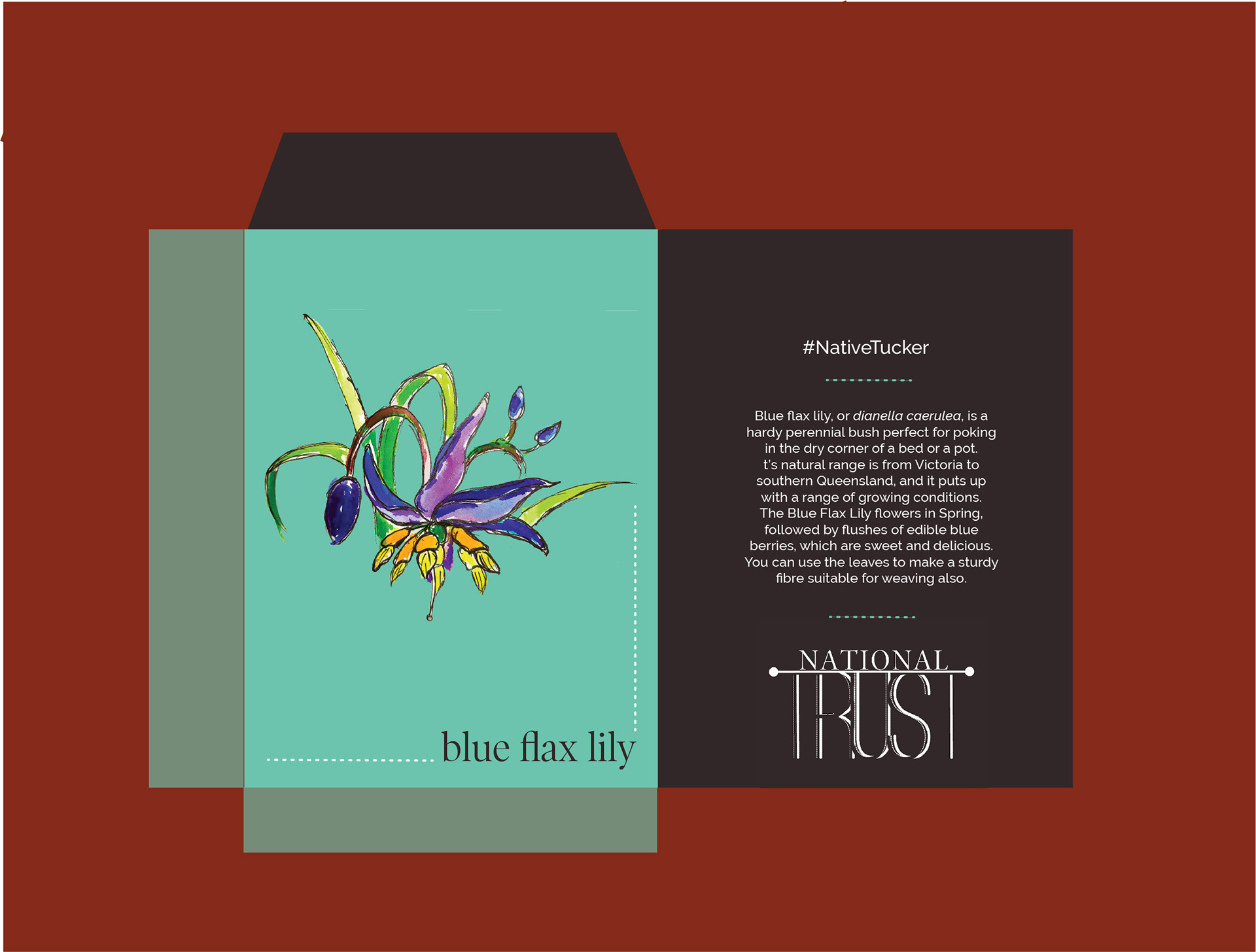
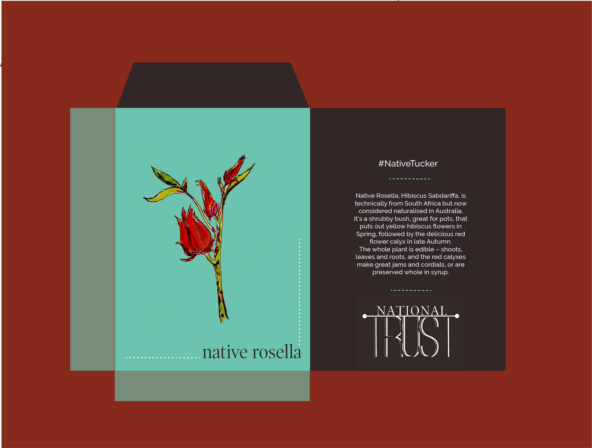
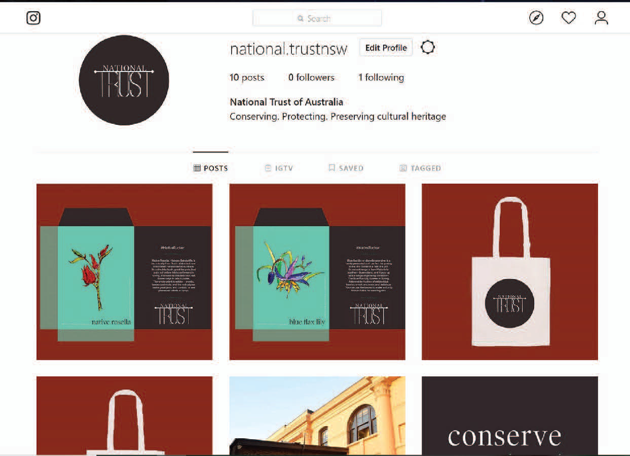
Merchandise prototypes designed as part of the rebrand launch event, starting off with a #NativeTucker campaign educating people about the benefits of planting and eating native bush foods. Attendees of the campaign launch would leave with calico swag bags containing native seed packets and saplings. The merchandise features prints of hand painted native flora.
As a part of the launch campaign, the calico bag would contain a pocket timeline featuring the new motto "Conserve Protect Preserve" to inform prospective donors and members about the history and landmark dates of the National Trust, concisely.
